iSchool Capstone

2013

Project Logo

Enterprise Architecture Component Mapping for Costco

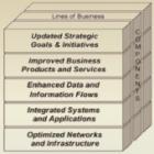
As Costco’s business expands at a rapid pace, new lines of business result in added complexity for their information systems. As a result, the inter-connection between different lines of business has been obscured, and systems isolation has increased across the organization. Our project established inter-connectivity among different entities using an Enterprise Architecture Model.  We focused on technology aspects like security, infrastructure, and information, mapping these elements to suitable components within the lines of business.
Project Logo

Fovea: Information Security Threat Modeling Using Big Data Analysis Techniques

Until now, security staff at a Seattle-based financial software and services company have spent a great deal of time and energy collecting and processing enormous volumes of security log data from a variety of data sources on our networks. This reduces the time we have to analyze the data and remediate risks that we uncover. The Fovea tool automates the collection and processing stages, allowing us to focus on analyzing the data and acting on the results. Fovea has already produced significant findings: we have begun geomapping unusual connections, and found traffic from unexpected places. We have discovered numerous network configuration errors that increase our risk exposure. Most importantly, we cross-referenced our traffic with the FBI’s database of known hacktivist threats, and discovered that we are a target. As Fovea grows in capability and complexity, we believe it will continue to demonstrate the value of collecting and analyzing security log data to improve situational awareness.
Project Logo

Interactive Visualization for Mental Health Data

Mental health clinicians, researchers, and program managers require good data to make good decisions. The Mental Health Research Network (MHRN) has collected a significant quantity of population data, but action based on this data is hindered without extensive technical training and experience. This limits the data’s impact to improve health care outcomes and performance by preventing a wider audience from using the data to make high-level care and policy decisions. We worked with the Group Health Research Institute to design an interactive tool that transforms health care data into understandable visualizations, which are easy to explore.  Our tool will provide translational research; encourage people to ask questions; and promote data-driven healthcare improvements, ultimately impacting over 11 million patients across the United States currently served by the MHRN.
Project Logo

Measuring Influence of Digital Personas

Social influence in the physical world can be correlated with intangible attributes like charisma, attraction, and charm. In translation to a digital context, the concept of influence is still very much connected to these types of human elements, but their impact becomes measurable. The value in determining how much impact an individual has on a specific topic of interest is becoming clearer as more companies depend on digital communities for product awareness. Using a defined metric for domain-specific impact factor in conjunction with predictive modelling, we are able to visualize some interesting trends of influence among Twitter users. Not only can these findings assist in integrating social media into an effective marketing model, they can potentially outline a more direct return on investment.
Project Logo

Mood Journal

Mood Journal is a web application that allows mental health patients to log their daily moods and behavior in order to help their therapists to better treat them. This project was inspired by the observation that when patients arrive in mental health clinics, they are given questionnaires to fill out that ask them about moods and behavior in the past two weeks. Considering how fleeting and variable moods can be in such a long span of time, it’s impossible for an individual to accurately answer these questions. Therapists often rely on these questionnaires to both diagnose the patient and to help guide the therapy session. It therefore becomes crucial that the responses are as true to the patient’s state as possible. Mood Journal addresses this issue by prompting users to fill out a 3 question, scaled survey every day, asking about their mood, physical energy level and enjoyment of activities. If their survey score is below a certain threshold then they are asked to fill out a short questionnaire that further inquires about their behavior for that day. Mood Journal displays past logs to patients for them to observe trends in their mood and also allows them to send messages to their therapist if they have concerns. In addition, if a patient is experiencing an extreme low, they are redirected to the necessary resources while the therapist is notified. We hope that with our tool, mental health services will run more smoothly and accurately than ever.
Project Logo

Park It: Seattle

Finding parking in Seattle has always proved to be a significant challenge. We, Team Wildfish, created Seattle ParkIt to address this issue. We have developed an Android application that will allow users to search for and locate parking in the Seattle area based on when and where they would like to park. Basing our design choices around user testing, our app is designed to make parking fast and easy. We are leveraging the Seattle Department of Transportation’s parking sign database as a data source. Initially we have an app designed for parking in Seattle, but ideally this can be expanded to cities both around the state and the country.
Project Logo

Sleep Fixer

Have you ever suffered from a bad sleep schedule that you want to get away from? Don’t you know that using your mobile phone to tracks your sleep schedule is super easy? Sleep Fixer is our Windows Phone answer to this problem. It appears as an alarm clock app, tracks users’ sleep schedule, and visualizes the collected data. The app tracks users’ everyday sleep time, wakeup time, and wakeup mood. Then it uses the data to create multiple charts including the average time in bed, the average time of going to bad, the variance of bed time, etc., and generate a Sleep Score. The app provides a simple data structure and vibrant visualization, which enables the user to get a clear picture of how well he/she sleeps. Furthermore, by comparing the sleep scores generated from different time periods, users can interpret whether their sleep quality is improving.
Project Logo

Why Search Twice

Web history supposedly shows users where they have been and finds websites they previously visited. Currently, browsers display web history as a dense, hard-to-read list. This list does not reflect how users use web browsers and does not match the relational way that humans remember. Our research shows that these basic history pages provide little value to users, who are forced to make up for inadequate functionality with bookmarks or memory. Our service takes this underutilized but highly potent data and visualizes it so users can better understand how they use the web. We compile meaningful graphs, trends, and relationships to give users insights into their browsing behavior. While we are beginning with this foundational tool to collect and display data, we plan to expand this service to be able to help users discover websites based on their previous browsing and be able to easily locate past websites they’ve visited via natural language graph search.

Project Logo

StorySite: Giving The Gary Greaves Oral History Digitization Project Geographical Context

StorySite is an interactive Google map designed for the University of Washington Libraries Special Collections: Gary Greaves Oral History Digitization Project. StorySite connects digital oral histories with their geographical locations and displays them in an accessible and user-friendly manner. Using historical interviews collected by Gary Greaves (d. 2009), an aspiring journalist and author, the project involved interview deselection (choosing from over 153 available recordings), audio editing (cutting,amplifying, and reducing background noise), metadata development (for arranging and displaying the stories by subject), icon selection, website consultation, and Google map implementation (via JavaScript). The recordings selected for this interactive map were cut into 1-3 minute story clips to echo the most important lessons reflected in the complete collection. These interviews, collected in the 1990s, describe multiple perspectives of the development Seattle went through during the 1950s-90s. This information provides an untold perspective of the history of Seattle that deserves our attention.