iSchool Capstone

2021

Project Logo

Sno-Cap: Data Migration, Consolidation & Visualization

The Sno-King Amateur Hockey Association collects and stores tens of thousands of registration and donation data entries across seven different platforms each year. With their data storage not being centralized, accessing their data has become increasingly difficult as the organization has grown and more data continues to flow in. For our Capstone project, we were tasked with creating and filling a centralized database, and then making analyses based on that data. From the work we have done, our sponsor will be able to make their own analyses to make better marketing decisions for its adult and youth hockey programs.
Project Logo

Tracking Online Disinformation on Social Media

The advent of social media has led to users unable to distinguish between misleading and real information. To tackle this, we have developed an online disinformation mapping tool that extracts data from Twitter for any user-defined hashtag, classifies it as real or fake, and then visualizes the spread of misinformation for that topic. Our project is aimed to help journalists, political entities, and responsible citizens by raising awareness and promoting informed decision-making.
Project Logo

UW Rowing Data Visualizer

Over 70% of the UW Women’s rowing team struggles with overtraining every year. We built an application that helps these athletes better understand their training data, and with those insights, make better decisions to reduce overtraining. Apart from analyzing large amounts of training data, we worked closely with student-athletes and team doctors to understand the symptoms of overtraining and define rowing metrics to create a training dashboard. Our Rowing Visualizer aims to help rowers and coaches better understand the effects each training has on team performance to avoid the negative outcomes from overtraining.

2020

Project Logo

ACEs and TIC Dashboard

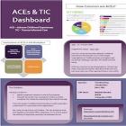
One cause of PTSD is childhood trauma. Ten questions have been developed to measure ACES. High ACES scores are linked to negative mental and physical health which adversely affect work performance. Transforming Connections requested a system to analyze the ACES score for organizations using the ACES survey. Our system consists of distributing the survey through Survey Gizmo and analyzing the data with Tableau. The sponsor utilizes the Tableau dashboard to provide their client with a report consisting of: the company’s environment compared to the national average, areas for improvement and customized action for an improved work environment.
Project Logo

ADS Dashboard

Aging and Disability Services (ADS) in King County surveys older residents who participate in senior center activities to determine the performance of these centers. However, the data collected isn't as helpful as it could be in decision-making. Our project digitized the data collection process and created a dashboard to visualize the survey data. ADS managers are now able to easily grasp how centers perform relative to one another and identify centers which may need assistance to best serve their community. ADS can use this information to allocate funding and design programming to improve the wellbeing of older King County residents.
Project Logo

Analyzing Drug Administration in Africa

The Gates Foundation partnered with ESPEN to create an open access data portal for the purpose of empowering Ministries of Health and other partners with the information necessary to drive efficient investments for neglected tropical disease treatment. This project aims to address low utilization of the ESPEN portal through the development of new metrics and dashboards that health officials can derive actionable insights from. By leveraging publicly available data from ESPEN and consolidating many relevant data points, we have provided tools for health officials to more effectively identify and act upon points of concern in drug procurement and administration.
Project Logo

Automation of Apps Segmentation and Persona Labeling

Based on users’ large-scale app installation data, we established an automated process for T-mobile to segment their users and create persona labels with machine learning. This process will improve mobile advertising services. We conducted social network analysis to cluster users, did topic modeling (LDA) for apps, extracted distinctive keywords in each community with linear sum assignment to build user personas The persona is able to show multi-dimension characteristics of mobile audiences such as popular apps, genres, topics within each community.
Project Logo

Azure Machine Learning: Understanding Behaviors That Lead to Customer Retention

The Microsoft Azure End to End platform team is invested in identifying an efficient way to steer revenue growth prospects and to further improve user experience as well as increase the customer retention rate. Our project involved the data validation, data quality check, metric definitions and automated pipeline building. Our analysis serves as a foundation towards data-driven decision making for customer retention. The result can be utilized to monitor the user behavior and performance in real time to provide the better service and garner customer loyalty.
Project Logo

Behance Recommendation Engine

Behance is a social media platform owned by Adobe that allows artists to develop and share their artwork with other users. With more than 10 million users searching for inspiration, personalized recommendations play a pivotal role in the overall UX. The current recommendation algorithm at Behance requires substantial user activity to generate recommendations and surfaces artwork with higher likes more often. To make these recommendations more fine-tuned, we developed an algorithm using Cypher, that analyzes the activity of all related users & provides weight to project themes instead of likes. Our algorithm also reduced the recommendation generation time by 50%.
Project Logo

Bird the Gap: Interactive Web Maps to Inspire Engagement with the Natural World, Inform Scientific Research, and Support Conservation Action

Bird the Gap is an outreach-oriented web mapping project to direct birdwatchers to locations currently underrepresented in crowdsourced data compiled by eBird and the Cornell Lab of Ornithology. My multi-layered interactive web map uses two sets of raster data from eBird’s statistical models to identify geographic gaps in worldwide data from 2018. Using open-source software programs RStudio and QGIS, I prepared data for all 52 weeks. The scalable prototype uses Mapbox and its JavaScript library to visualize data from one week in July. Bird the Gap will assist in eBird’s ongoing mapping projects, which support scientific research and conservation efforts.