Faculty, staff or current student? Take the UW Climate Survey

iSchool Capstone

2014

Project Logo

Tipout: Tip Handing for Waiters

The goal behind our project is to reduce the amount of computation waiters and waitresses perform at the end of their shifts while trying to “tip out” their support staff. Currently in most high-class restaurants, the math and tracking for payouts is left to the individual waiters to handle, which can often be complicated and difficult to keep a detailed history of. As of right now, most waitstaff do this computation by hand which takes significant amount of time. By creating a web application that will be accessible on phones and desktops, we can allow employees and businesses to keep better track of what tips they are making and who they are distributing to wherever they go.

2013

Project Logo

Alaska Airlines Incident Management System

Weather delays. Mechanical failures. Network outages. Each day, airlines are confronted with incidents that affect the efficiency of their operation. Effective management of a deluge of information is the key to a successful response. Poor communication can lead to stranded aircraft, passengers, and cargo; and in the event of an accident, information may be a lifeline. Our project designs the framework for a web-based incident management system for Alaska Airlines, meeting the company’s requirements for an intuitive interface that requires minimal training, and the ability to sort, search through, and share large amounts of data. This communication system enables resolution of complicated incidents and helps Alaska remain the #1 carrier in on-time performance.
Project Logo

Alaska Airlines: Flight Attendant Productivity Tool

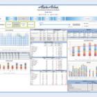
Alaska Airlines is a major commercial airline based in Seattle, Washington. They employ approximately 3,000 flight attendants who provide direction and assistance on flights within North America. A daily focus on flight attendant scheduling and productivity metrics is necessary to effectively manage airline costs, minimize operational delays, and forecast future productivity to generate revenue and maintain market share. The interactive Flight Attendant Productivity Tool prototype we developed packages scheduling and productivity metrics in a clean and in-depth decision-making format. The tool provides Alaska Airlines management with continuous access to relevant and accurate staffing data and productivity metrics to monitor flight attendant productivity and forecast staffing needs. It enables Alaska Airlines to maintain efficient airline operation and to remain competitive in the airline business.
Project Logo

BlackRock

The eXtensible Business Reporting Language is the new standard for business reporting and all companies who file their information with the government must comply. We have created an application which serves as a layer of abstraction between XBRL filings and BlackRock employees who want to monitor their competitors, which originally required tedious and time consuming scanning through individual PDF documents for comparison. We have gathered XBRL filings from BlackRock’s competitors and aggregated them on a website. Our tool enables BlackRock employees to conduct detailed evaluations regarding how the fees of a BlackRock fund compare to a competitor such that they may make informed decisions to adjust their business strategy accordingly.
Project Logo

BLAST! The Boeing Library Automated Statistics Tool

The Boeing Company Library was among the first corporate libraries to institute an online chat reference service, known as Ask-A-Librarian. The Boeing Library Automated Statistics Tool (BLAST!) is a custom-built, database-driven dashboard for displaying real-time, visualized metrics about the Ask-A-Librarian service. BLAST replaces error-prone data manipulation and inefficient, time-consuming data analysis with instantaneous, attractive graphs for quickly assessing operations. This business-intelligence tool utilizes the best, non-proprietary code libraries and standards, and was created especially by yours truly to be scalable to other library services. The countdown to performance optimization has begun: 3, 2, 1 … BLAST off!
Project Logo

Canadian Environmental Health Atlas: Visualizing the Link Between Air Quality and Mortality

80% of the world’s population breathes air that is unhealthy. Airborne pollutants from human activities contribute to at least 7% of premature deaths worldwide, primarily from cardiovascular disease. Public awareness about these risks is remarkably limited. Despite efforts to disseminate data about air quality and decades of research correlating pollution and mortality, informational tools that demonstrate the relationship between air and health in an accessible, straightforward manner are scarce. The Canadian Environmental Health Atlas aims to educate and empower citizens and policy makers by revealing the links between environmental toxicants and diminished health. Our contribution to the Atlas is a data visualization that brings to life the relative risks to human health from polluted air. Using estimates of airborne particulate matter derived from satellite imagery, we join air quality measurements and mortality statistics in a geo-spatial format. Our goal is to present complex science through a comprehensible, interactive visual experience.
Project Logo

Chess Scouter

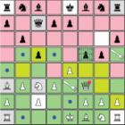
Inexperienced chess players fixate on small sectors of the board and individual pieces. Visualization is one key to better perception and understanding of a chess game. We present Chess Scouter, a digital chess application that dynamically overlays visualizations onto the board that emphasize and clarify the overall state of the board, pieces, and the relationships between them. We speculate that by visually emphasizing these details, novice chess players will be able to more quickly and meaningfully interpret important threats, patterns, and opportunities, and make better moves. Initial response to Chess Scouter indicates that users enjoy playing with the visualizations and are encouraged to examine the board as a result of them. We will conduct further investigation with a qualitative study on novice chess players to determine the clarity and utility of the visualizations in Chess Scouter.
Project Logo

D//Jargonizer

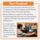
While people familiar with the field of Information Technology (IT) are able to understand new terms by associating them with previous knowledge or current context, those outside the industry struggle with new words and acronyms as they read dense technical documents. In these circumstances, people often rely on free resources like Wikipedia, but results often require disambiguation or a deeper search in order to find the appropriate definition for a term. Additionally, switching attention between reading and searching has been shown to increase cognitive load and perceived stress level, while reducing the effectiveness of both tasks. To address this problem, we created D//Jargonizer: an extension for the Google Chrome web browser that allows users to define technical terms in context with minimal distraction. When users right click a word on a web page, a brief version of the term’s Wikipedia entry is displayed in context. After testing our prototype with several individuals, we refined our initial design to deliver a seamless user experience. By limiting the need for rapid attention switching between windows or tabs, our solution reduces cognitive load and improves the overall user experience as people read jargon-heavy documents.
Project Logo

Enhancing Customer Experience: Boeing CEC App

Boeing is continuously looking for ways to enhance the customer journey at its Customer Experience Center (“CEC”), where aircraft priced at hundreds of millions of dollars are marketed to airline executives worldwide. At the CEC, customers are given a tour of airliner mockups, which relies heavily on verbal descriptions, limiting the amount of information that can be communicated. For our project, we conceptualized and prototyped a location-aware application for client use throughout the tour. This app will provide customers detailed descriptions of Boeing aircraft by seamlessly transmitting information tailored for specific airlines relative to the user’s location within the tour. Utilizing a combination of Wi-Fi triangulation, Geofencing, and NFC technologies, the intuitive user interface displays images of alternate interiors layouts, configurations for lighting, colors and setups, as well as data such as fuel prices and measurements automatically relevant to the user’s location. Creating a seamless way to share information.
Project Logo

Fovea: Information Security Threat Modeling Using Big Data Analysis Techniques

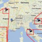
Until now, security staff at a Seattle-based financial software and services company have spent a great deal of time and energy collecting and processing enormous volumes of security log data from a variety of data sources on our networks. This reduces the time we have to analyze the data and remediate risks that we uncover. The Fovea tool automates the collection and processing stages, allowing us to focus on analyzing the data and acting on the results. Fovea has already produced significant findings: we have begun geomapping unusual connections, and found traffic from unexpected places. We have discovered numerous network configuration errors that increase our risk exposure. Most importantly, we cross-referenced our traffic with the FBI’s database of known hacktivist threats, and discovered that we are a target. As Fovea grows in capability and complexity, we believe it will continue to demonstrate the value of collecting and analyzing security log data to improve situational awareness.