iSchool Capstone

2018

Project Logo

Voyager 2 - Jupyter Extension

JupyterLab is one of the most popular tools for coding and sharing Data Science work. However, as with any coding-based tool, creating and exploring data visualizations within a Jupyter Notebook is tedious and inefficient. Our extension integrates Voyager 2 with JupyterLab to help data scientists seamlessly iterate between modeling and visualization within one of the most popular Data Science computing environments today. Most importantly, it will let people focus on exploration over specification, which ultimately leads to better analysis and decision making.
Project Logo

Waldo - A smart way to find smart people

Machine Learning and AI are increasingly powering the products in the world. With a small talent pool scattered around the country, how can companies find leaders to help build the next big thing? In partnership with Amazon’s Strategic Recruiting Team, the project provides a revolutionary tool to enable recruiters find the right talent in niche areas of applied sciences. The tool gathers information about prospective candidates, explores their social connections and understands the spread of talent communities in the United States. The insights help recruiters engage with the right candidates and match them to the right roles within the organization.

2017

Project Logo

Best Intentions

Our research aims to model changes in students’ intended major, specifically whether a student plans on majoring in a STEM field or not. We use a Dynamic Naïve Bayesian Network as a model, which is created using transcript records from the UW Coursector Project. Our initial modeling captures which field a student will graduate in and whether or not a student will switch from a STEM field to a non-STEM field as well as when that switch will occur. Our project hopes to help decrease the over 50% attrition rate from STEM programs in the US.
Project Logo

BlockBusters: Combining the Dark Web and Bitcoin

The Dark Web and Bitcoin are both digital systems that the average person has little understanding of. Yet both of these platforms have very real impacts on the world and can affect people without their knowledge. The Dark Web is a new digital black market that uses Bitcoin as its primary currency. Both of these are considered anonymous, yet they can be combined. Similar features could then be used, matching Bitcoin and Dark web users. Our team cleaned and parsed the two data sets, combining them in one location and exploring the information they contain to start the deanonymization process.
Project Logo

Boosting University-Industry Collaboration

IN-PART is a startup established in the UK. The company provides collaborative opportunities for universities and industries to commercialize innovative technologies at an early stage. The growth of the company calls for a more efficient match of technology with industrial interests, as well as an automated visualization platform. Our capstone project is rooted in such needs from IN-PART. We analyzed user interaction data collected from its website to implement a recommendation system and created a visualization interface to provide universities with industry feedback and quantify commercial interest in their technologies.
Project Logo

DataShore

It’s no secret that environmental conditions are changing rapidly and it’s more important than ever to predict the accompanying consequences. Collecting environmental data is not only expensive, but dangerous. We created an algorithm that allows environmental professionals to fill in missing data and explore interactions between correlated variables. This permits scientists to gain an understanding of our dynamic ocean and help us prepare for and mitigate any potential environmental harm. Be sure of your data with DataShore!
Project Logo

FlourishOA: Discover Your Open Access Options

Open Access (OA) publications allow for anyone to access research information free of charge. It is difficult for researchers to discover which OA publications exist, and the price to publish. We designed and implemented a data-driven web app and API enabling researchers to discover relevant and reputable OA publications to maximize publishing impact. We aggregated price information and journal impact data. Our goal is to provide the OA community with the tools they need to separate legitimate OA publications from unethical publishers. We believe transparency in the market will produce downward price pressure, further lowering economic barriers to publishing.
Project Logo

Gettin' Figgy With It: A Mixed Method Data-Driven Analysis of FIGs at the University of Washington

The University of Washington’s First-Year Interest Group (FIG) is a program designed to promote social cohesion and present academic options. Our team aimed to measure the impact of the program, using a study leveraging transcript data on over 60,000 students. We found FIGs provide an increased graduation rate of 5.9% to all students and up to 13.3% and 8.7% for underrepresented groups and Hispanic students, respectively. We also surveyed students, finding that friendship facilitation serves as the most beneficial aspect of the FIG program. Our research lays a groundwork surrounding the impacts of academic first-year programs at large universities.
Project Logo

Gradient: Crowdsourced Street Parking Finder

Finding parking in busy cities is stressful. Out of a sample of drivers in Seattle, 83% stated that they prefer public street parking to paid garages or lots, citing the significantly lower cost-per-hour and proximity to their intended destination. However, repeatedly circling an area for parking creates anxiety, increases traffic congestion, and pollutes the environment; consuming both time and gas. Gradient aims to streamline the street parking experience by leveraging civic parking data, crowdsourced user-input, and machine learning to predict the availability of nearby public street parking in real-time.
Project Logo

Graphical Perception of Stacked Area Charts

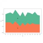
Stacked area charts are a common method for visualizing multiple time series, but they are frequently criticized for being perceptually ineffective or misleading because the top segments are distorted by the ones below. I conducted an experiment to examine how accurately viewers can read the values in these charts. Most participants correctly identified which of two marked segments of each chart was smaller. Participants’ judgments of the relative sizes of the marked segments were less accurate when segments were closer in size, and were somewhat higher overall than in previous work on other chart types.