Graphical Perception of Stacked Area Charts
Project tags:

data science & visualization
Research Award

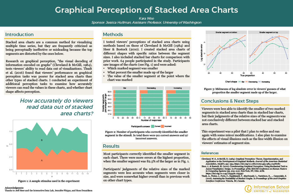
Stacked area charts are a common method for visualizing multiple time series, but they are frequently criticized for being perceptually ineffective or misleading because the top segments are distorted by the ones below. I conducted an experiment to examine how accurately viewers can read the values in these charts. Most participants correctly identified which of two marked segments of each chart was smaller. Participants’ judgments of the relative sizes of the marked segments were less accurate when segments were closer in size, and were somewhat higher overall than in previous work on other chart types.
Project sponsored by: Jessica Hullman, Assistant Professor, Information School, University of Washington
Project participants:
Kara Woo
MLIS
