The landscape around Puget Sound is changing rapidly. New homes are built, trees are cut down in one place and planted in another. New roads are constructed and old roads are rerouted.
Keeping track of it all is a dizzying challenge. A group of students from the iSchool are creating a program that will help experts and the public visualize those changes to the landscape using data from the Washington Department of Fish and Wildlife.
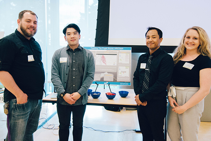
Public data like this is incredibly powerful, but it needs a way to be shared and understood easily. For their Capstone project — which is the culmination of studies for iSchool students (pictured above) — Master of Science in Information Management students Amanda Cummings, Edmund Deng (second from right), Jeffrey Seward (left) and Informatics undergraduate student Vichit Sitthideth are using open-source software to help make the data accessible, understandable and useful to the public. They have created a working prototype, using data from one water resource inventory area. The students and the agency hope the project will empower people to make more informed decisions about land-use policies.
“We always need an informed public,” said Seward, whose MSIM specialization is business intelligence.
The data, though, is far from simple. Cummings said it took her team several hours of meeting with their sponsors to get a thorough understanding of how the data work.
The information from the WDFW begins with high-resolution aerial photos from the U.S. Department of Agriculture. The photos are then corrected to create a flat image. Then, software analyzes the photos to see where things have changed. Then the data is reviewed to ensure the software properly categorized changes.
All of that ends up with a lot of data that can be analyzed using GIS programs such as ArcGIS. That program is expensive, however, and is hard for the average user to learn. There was no way for someone, for instance, to zoom in on their neighborhood or around their farm and get a visual overview of how things had changed.
The Capstone team’s prototype shows polygons that overlay the map. The polygons are color-coded based on the type of change and users can hover over an individual area to see more detailed information on what has changed.
Ken Pierce, of the Habitat Science Division of WDFW, said this is something the department has worked on for a long time. It’s particularly useful information for efforts to protect areas that are critical to salmon and other species at risk. Pierce said the department wanted to be transparent with its scientific data, and share it widely. But it didn’t have the funding to create a system that would make that possible. That made a partnership with iSchool and the expertise of the MSIM students particularly valuable.
Pierce hopes the tool will help people make more informed decisions, based on the realities of how the land is actually changing, rather than on perceptions. It could, for instance, help demonstrate where habitat fragmentation is a problem and whether habitat recovery efforts are having the desired effect.
“A lot of the goal is to create a more sustainable Puget Sound into the future,” Pierce said. “How do we accommodate population growth and also protect the natural amenities that make people want to live here? That’s our big challenge.”
The tool could be an effective way to measure whether policies to control growth are working. The information could be also useful for someone wanting to know how much green space has been lost in a neighborhood. Or a farmer could use it to visualize how land changes might affect runoff onto the farm.
Members of the team put a lot of focus on making sure the information was user-friendly. Before they began any programming work, they used their experience from the iSchool to decide on a design that would best serve users.
It was a challenge for the team to decide on a design that would look good to everyone — to scientists who have an intimate knowledge of the data, or to members of the general public who know nothing about GIS.
“We asked ‘How do people expect to see info like this and how do we design it to make it intuitive,’” Cummings said.
The team put ideas on paper, and tested them with both experts and non-experts to see how their designs were working.
The iSchool training was vital during this work.
“It was nice to be able to have a good base of understanding of what a good design would be,” Seward said.
The team used feedback from the test users to further refine their designs. It was gratifying for the team to find that, in most cases, the users agreed with the team’s design. It gave them confidence in the skills they’d learned at the iSchool. And when the users found sticky points, the group had the tools they needed to find a solution.
Team members worked together, utilizing their own specialties.
“A multidisciplinary team working together really opened up what was possible with the project,” Seward said.
The group brought all their skills together to make a program that would help a person who knew nothing about GIS be able to quickly and easily understand the WDFW data.
“Agencies around us do amazing work, but we don’t always get to see that work,” Seward said.
The prototype only looked at one slice of the available data. In the future, that could be expanded to include the rest of the Puget Sound area. Pierce also hopes to eventually be able to use the dashboard to do more automated analysis, on a larger scale.
Pierce said he appreciated how the students took the skills they had learned and applied them to a real world problem.
“It’s one thing to learn a lot. It’s another to use that knowledge to produce something,” he said. “It was a great partnership for the government and the students.”