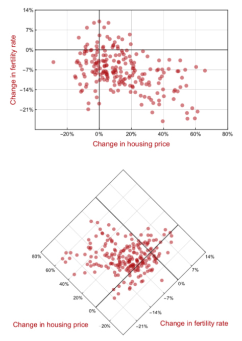
Could simply tilting a scatterplot graph’s axis help prevent people from confusing correlation and causation?
Research by Information School Assistant Professor Jevin West and colleague Carl Bergstrom, a biology professor and affiliate iSchool faculty member, proposes a “diamond plot” approach to data visualization, tilting the graphics at a 45-degree angle. At this angle, neither the X axis nor the Y axis appears to take priority or imply that one factor causes the other.
The research, first posted in a paper on arXiv, was featured Oct. 4 in Nature and in Fast Company.
Simply tilting graphics won’t solve the fact that the media, the public and even scientists themselves often read causation into data when they are simply seeing correlation, but West and Bergstrom theorize that it could help address the persistent problem.
“You could go through the last 2 weeks and you could find any number of examples of cases,” Bergstrom told Nature. “Red wine causes this, chocolate causes that.”
The duo, known for their “Calling Bullshit” course and curriculum, don’t make any such assumptions in their paper. Their next step is to investigate how people read the diamond plots through user testing.